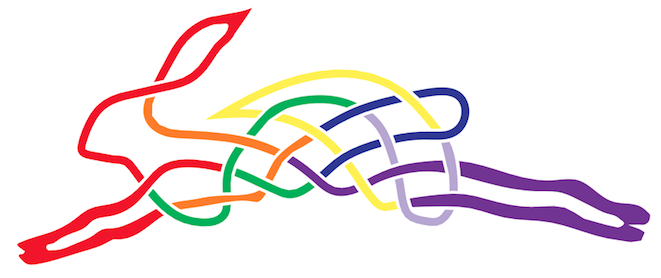
Welcome to Rainbow Hare for this quarter’s Endeavourers reveal post. This time our theme is ‘Colour Theory’.
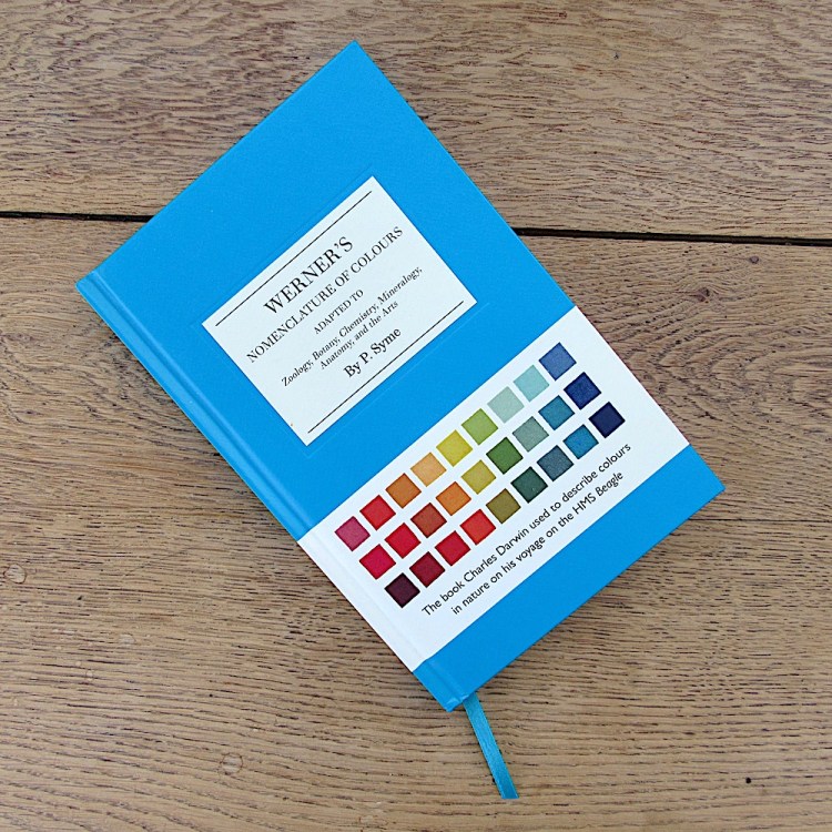
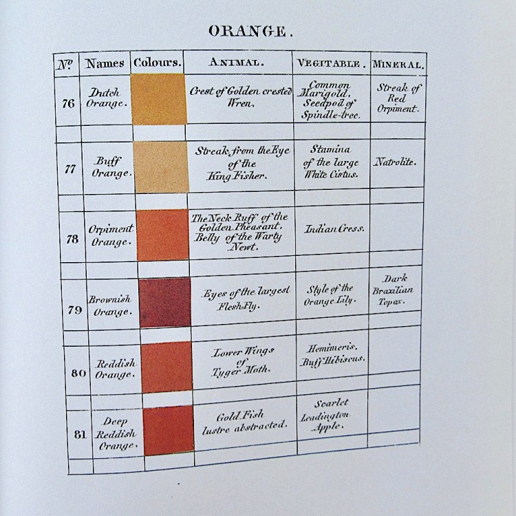
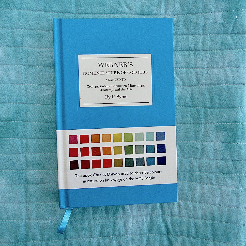
At the beginning of this quarter, I mentioned to Catherine that I was not looking forward to this theme and she kindly sent me a most wonderful book – Werner’s Nomenclature of Colours. It is amazing to think that Darwin used this used book and I can see why he did. It is beautifully laid out as a list of named colours with details of how to mix each colour and examples of where it may be seen in the natural world (animal, vegetable and mineral). After receiving this, I found a site about it online, which I’m sure you will enjoy browsing.
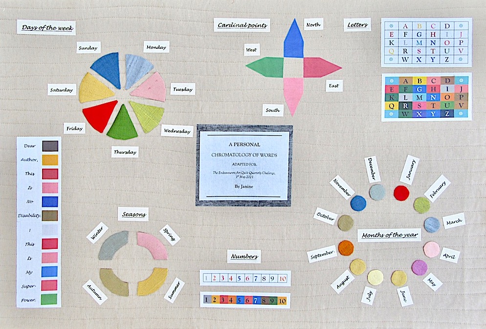
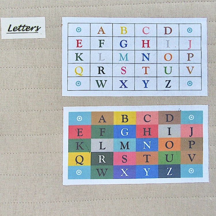
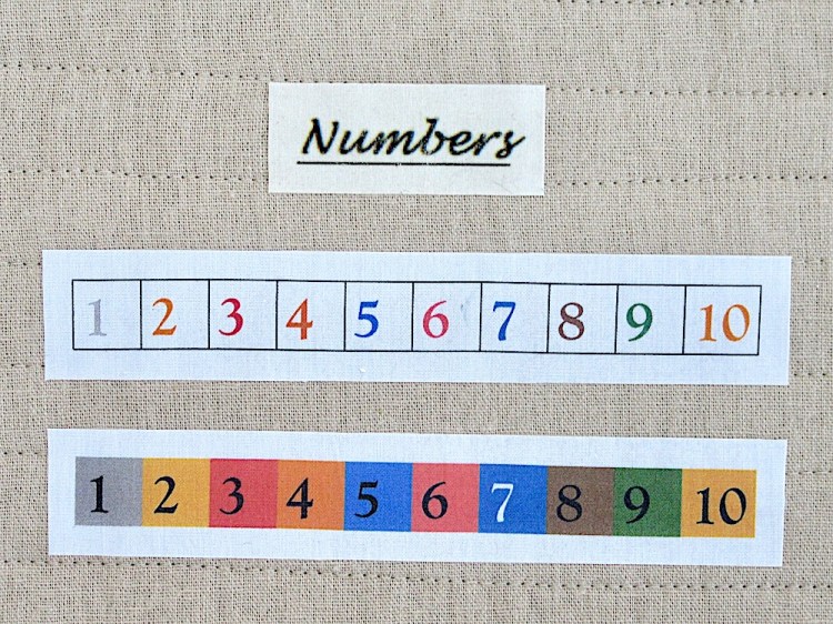
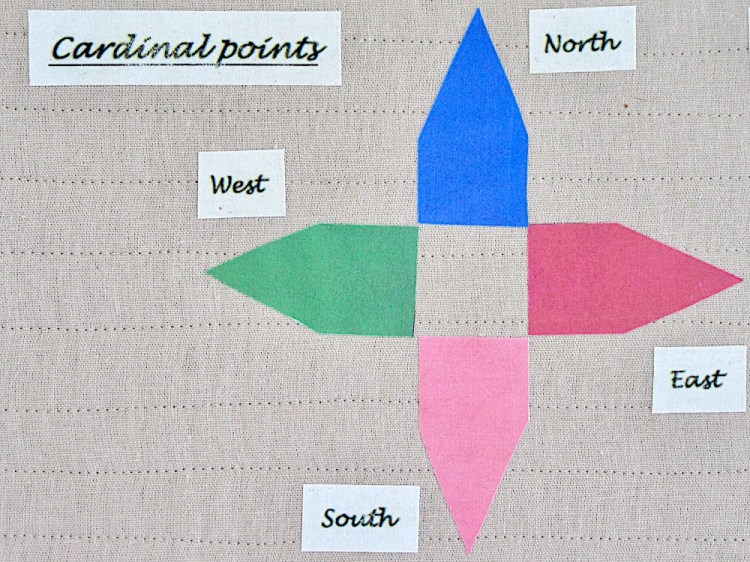
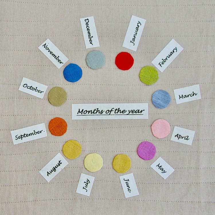
I decided, for this quarter, I would try to do something along the lines of this book but, instead of documenting where colours are found in the external world, I would use some conventional ways of illustrating colour theory to show the colours that letters, numbers and words display in my mind.
I always assumed this happened to everyone but recently I learned it is quite unusual and happens because there is some kind of mis-wiring in the brain. Whilst I was surprised to hear that, until this quarter, I didn’t give it much thought. Then I thought I’d better do an internet search to find out what it is actually called and I was even more surprised to read this:
In Synesthesia: Seeing Sounds and Hearing Colors I found the following:
Synopsis* : Synesthesia is a neurologically condition where people may see numbers or letters in color or see sounds and music there are over 60 types of synesthesia. Depending on the study, researchers have suggested 1 in 2,000 people have some form of synesthesia, while others have reported 1 in 300 or even as many as 1 in 23. One form of synesthesia, visual motion sound synesthesia, involves hearing sounds in response to visual motion and flicker. Published : 2011-07-03 – Updated : 2021-01-02
Author : Disabled World – Contact: Disabled World (www.disabled-world.com)
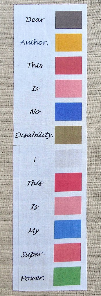
One of my ‘blocks’ is a response to that author, whose name is not given, but, more seriously, it does make me reflect on other ‘disabilities’.
I used a combination of printing on Photofabric and applique for the colours and I used Lesley Riley’s TAP transfer paper with white cotton sheeting for the labels. I attached the transfers and Photofabric prints to the quilt with bondaweb and, whilst this worked well with the Photofabric, when I ironed over the transfers with the pressing sheet some of the ink transferred to the pressing sheet giving an overall blurred effect :(
I originally planned to make a book with a ‘block’ on each page but, once I had made the various elements, I didn’t have many pages and it seemed like labouring the point to keep on with more coloured words. I was also running out of time so I decided to go for something more like a poster.
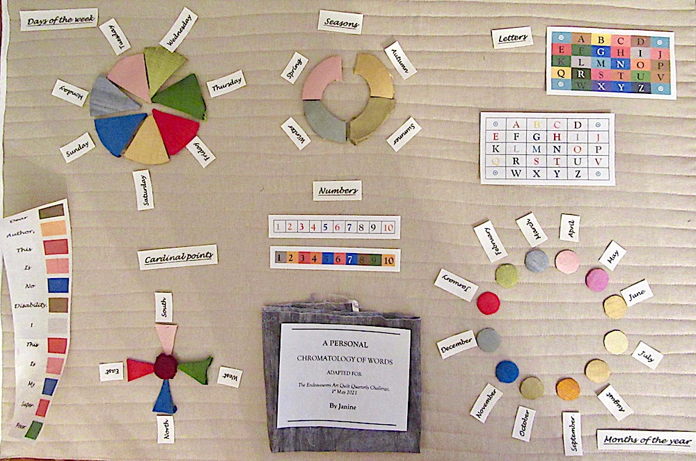
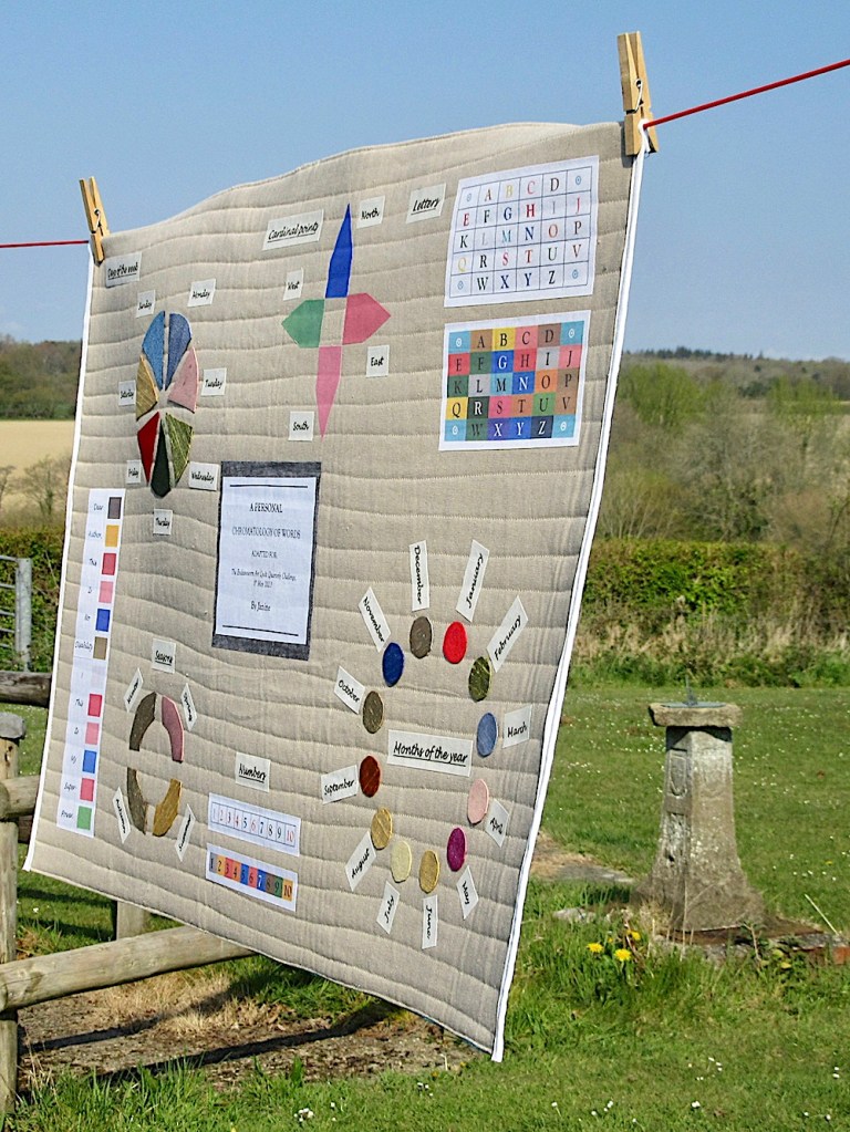
Perhaps ironically, these haven’t quite turned out to be the colours I actually see in my mind, though they are a reasonable approximation – unfortunately less so in the photos. I struggled to find exact matches (using Word 2011) for the colours on the Photofabric and then they printed a bit more dull than they displayed onscreen. The outdoor photo below captures the colours a bit better.
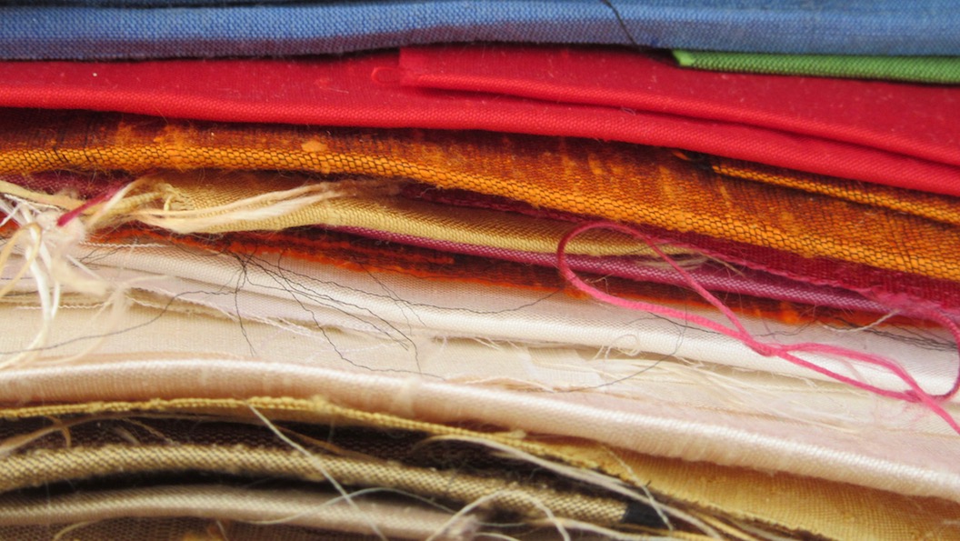
My stash of quilting cottons included a more limited variety of plain colours than I had imagined so, for the applique, I had to resort to an antique chocolate box of silks scraps.


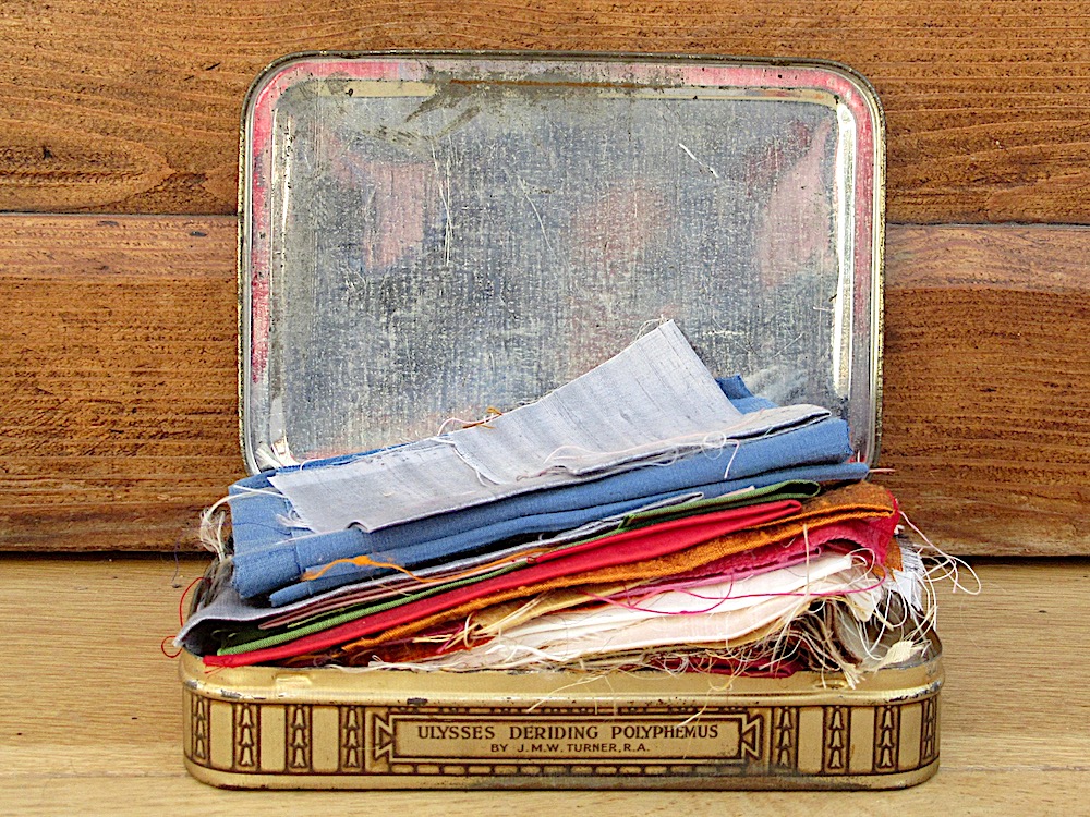
These did bear a better colour resemblance but they also frayed excessively and were such a challenge on the shape front that I eventually switched out the compass for Photofabric! I do like the general effect of the silk but I think machine piecing and/or leaving a larger seam allowance would have created a neater finish.

And I think that is about all there is to say about it.
I hope you will visit my fellow Endeavourers to see the quilts they have made for this quarter’s challenge. The reveal never fails to be an inspiration :)
Janine @ Rainbow Hare
(If you subscribe to my blog by email, firstly, thank you :) Secondly, I really recommend you view the web version because otherwise you end up with a random scramble of photos and I don’t know how to stop that happening).

piecefulwendy
I thoroughly enjoyed reading this post, and learning this about you. What pretty colours, too. You put a lot of work into this theme, and the finished product is so satisfying to see. Definitely a super power!
LikeLike
Andrée
Hi Janine, how amazing. That is definitely a super power. It’s great to see it on your fabric poster. Take care
LikeLike
Kim Sharman
Another interesting and fascinating read of your thoughts behind this new Endeavourers’ topic, Janine. Another clever interpretation of a topic. I admit, “All in the Mind” would have had me stumped. Another lovely finish. Your quilt looks pretty hanging in the spring sunshine.
LikeLike
benta hickley
I love the switch from disability to super power!!!! My niece has the colour version of this and a blogger I follow gets tastes with some words! I taste dentists mouthwash when I hear Chinese being spoken but nothing else! The poster is a great way to explain the effect
LikeLike
soma @ InkTorrents.com
I love it! I hope you are displaying this beautiful artwork proudly in your Makery to remind you of your wonderful super power. No wonder you dream in colour :)
-Soma
LikeLike